1.0 Introduction to Responsive Design
Responsive design has become a critical consideration in today’s web development landscape. It ensures usability and satisfaction by making web pages render well on different devices, including desktops, tablets, and smartphones. This approach benefits web designers, users, and developers. For example, designers and developers can create a single site that adapts to various devices, rather than building separate versions for each device type.
Responsive design is achieved using flexible grids and layouts, responsive images, CSS, and media queries. These techniques allow web content to dynamically adjust to the screen size and orientation, providing a smooth experience across all devices. This approach helps address common issues like disarrangement of columns and rows, performance problems, and accessibility challenges from the end users.
2.0 Basic HTML Table Structure
HTML tables allow web developers to arrange data into rows and columns, forming the foundation of structured data presentation. The elements of a typical HTML table are;
- <table> – This is the container element for the entire table and it defines the start and the end of a HTML table.
<table>
<!—The table content goes here –>
</table>
- <thead> – This defines the head that contains the <tr> element which in turn contains the <th> element.
- <th> (table header) – These are used to label columns in the table.
- <tr> – (table row) – This represents a horizontal row within the table.
<thead>
<tr>
<th>Header 1</th>
</tr>
</thead>
- <tbody> – This defines the body of the table, it contains <tr> which in turn contains the <td> element.
- <td> – These are used to define the actual contents of the table.
<tbody>
<tr>
<td>Data 1</td>
</tr>
</tbody>
- <tfoot> – This defines the footer of the data table, contains <tr> which contains <td>
<tfoot>
<tr>
<td>Footer 1</td>
</tr>
</tfoot>
2.1 Example of Basic HTML Table
In practice, a basic HTML table can be created using the following code;
<table>
<thead>
<tr>
<th scope=”col”>Product ID</th>
<th>Description</th>
<th scope=”col”>Price</th>
</tr>
</thead>
<tbody>
<tr>
<td data-label=”Product ID”>1028</td>
<td data-label=”Description”>Smartphone</td>
<td data-label=”Price”>$599</td>
</tr>
<tr>
<td data-label=”Product ID”>1500</td>
<td data-label=”Description”>Laptop</td>
<td data-label=”Price”>$1099</td>
</tr>
<tr>
<td data-label=”Product ID”>1620</td>
<td data-label=”Description”>Tablet</td>
<td data-label=”Price”>$399</td>
</tr>
</tbody>
<tfoot>
<tr>
<td>Footer 1</td>
<td>Footer 2</td>
<td>Footer 3</td>
</tr>
</tfoot>
</table>
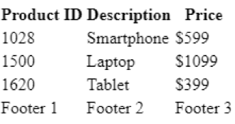
In this code, the tag <table> defines the table, <thead> contains the header row with <th> elements for column titles, and <tbody> defines the data rows with <td> elements for each cell’s content. In this case, the table has the headers, “Product ID”, “Description”, and “Price”, each with corresponding data rows listing various products. The <tfoot> tag is used for the table’s footer, and can be used to provide additional information if needed. This structure organizes data clearly, making it easy to read and understand.
Figure 1 shows what the basic HTML table created by the HTML code above looks like;
3.0 Applying Basic CSS Styling
Creating responsive tables in CSS involves using media queries to adjust the table layout based on the device type. CSS enhances the appearance of a web page by styling HTML elements, controlling visual properties such as colors, fonts, margins, padding, borders, backgrounds, and positions.
For instance, the background-color property is used to specify the background color of an element;
body {background-color: lightblue;}
th {background-color: #f2f2f2;}
The CSS border properties are used to specify the style, width and colour of an element’s border.
table {border-collapse: collapse; border:1px solid#ccc;}
Choosing the right font is crucial, and the font-family property specifies the text font. Depending on the needs of the user, and the information being passed, you can use different font types.
p {font- family: “Times New Roman”, Times, serif;}
Adding hover effects enhances the user experience. This can be done using the hover property.
tr: hover {background-color: #f1f1f1;}
3.1 Styling Table with CSS
Without any styling, our HTML example table looks plain. By applying basic CSS styling its appearance and consequently improve user experience can be significantly improved.
{margin: 0; padding: 0; box-sizing: border-box;}
body {
padding: 20px;
}
table {border-collapse: collapse;}
th, td {
text-align: left; padding: 8px; border: 1px solid #add;
}
tbody tr: hover {
background-color: #f5f5f5;
}
th{background-color: #4caf50; color: white;}
tfoot {background-color: #4a524a; color: white;}
After applying these styles, the table becomes much more visually appealing and user-friendly. Figure 2 below shows what the new table looks like.
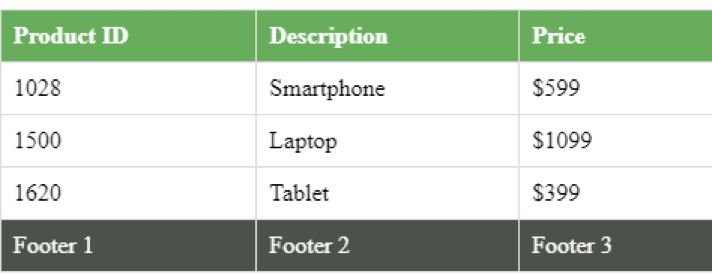
Figure 2: CSS styled HTML table
4.0 Making Tables Responsive with Media Queries
Media queries, introduced in CSS3, use the @media rule to apply CSS properties based on specific conditions. They make tables responsive by adjusting layouts for different screen sizes, such as switching to a vertical display on screens narrower than 600px. Media queries are essential for responsive web design across desktops, tablets, and mobile phones and can be used to adjust orientation, resolution, and viewport dimensions.
For example, to hide elements on smaller screens;
@media only screen and (max-width:600px) {
div {display: none;}
}
To change the font size based on screen width;
@media only screen and (min-width:60px) {
div {font-size: 80px;}
}
@media only screen and (max-width:600px) {
div {font-size: 30px;}
}
Breakpoints in media queries enable responsive designs that adapt to various devices and screen sizes, ensuring optimal user experiences. Figure 3 depicts such a responsive design.
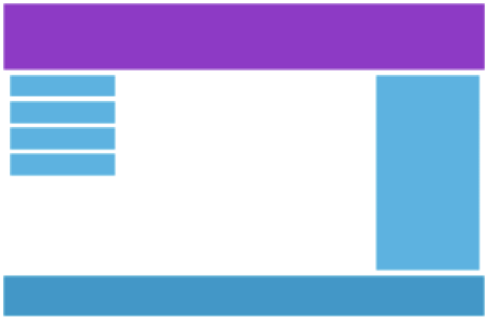

Figure 3: Desktop and Smartphone views of the same website respectively
4.1 Using Media Queries for Responsiveness
To make our earlier basic HTML table responsive, we can use the following media query to adjust its layout on screens that are narrower than 600px.
@media (max-width: 600px) {
table, thead, tbody, th, td, tr {
display: block;
}
th {
position: absolute;
top: -9999px;
left: -9999px;
}
tr {
border: 1px solid #ccc;
margin-bottom: 5px;
}
td {
border: none;
border-bottom: 1px solid #eee;
position: relative;
padding-left: 50%;
white-space: normal;
text-align: left;
}
td: before {
position: absolute;
top: 6px;
left: 6px;
width: 45%;
padding-right: 10px;
white-space: nowrap;
content: attr(data-label);
color: #000;
font-weight: bold;
}
tfoot td {
display: none;
}
}
After applying the media query, the table adjusts to vertical display on smaller screens.
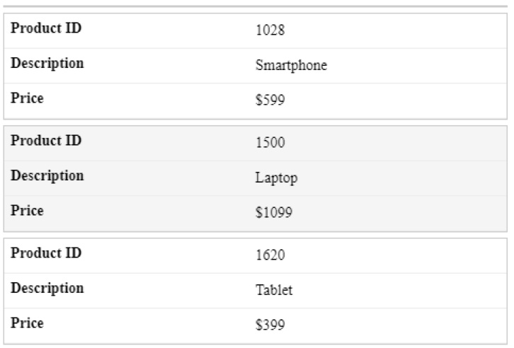
Figure 4: A responsive HTML table
5.0 Best Practices for Responsive Tables
Designing responsive tables involves applying several best practices to ensure they adapt well to different screen sizes while maintaining usability and readability. Here are some key best practices;
- Use media queries – Applying different styles to the table based on screen size, and adjusting font sizes, layouts, and other properties ensures a smooth user experience.
- Accessibility – Use HTML tags and attributes properly to ensure that tables are accessible to all users, including those using screen readers.
- Mobile first design – It is important to prioritize the needs and constraints of mobile users. Therefore, start designing for smaller screens first.
- Simple table structures – Use straightforward table structures to make them easier to render responsively, enhancing the user experience.
- Scrollable tables – Make use of CSS to make tables with many columns scrollable within a container. This prevents horizontal overflow issues.
- Testing across devices – Test tables on various devices using browser developer tools like Google Chrome and Mozilla Firefox. These tools allow us to simulate different device sizes and screen resolutions.
Following these best practices ensures that responsive tables are functional, accessible, and visually appealing across all devices.
5.1 Common Issues and Troubleshooting
When making tables responsive, several common issues can arise that need to be addressed to ensure a good user experience across different devices and screen sizes. Some of the most common issues include disarrangement of columns and rows when viewed from different devices, long loading times where large tables are involved, non-readable text on mobile devices and accessibility.
The disarrangement of columns and rows on different devices often arises when fixed widths are used for table columns. To resolve this, avoid setting fixed widths and instead use flexible units like percentages. This allows the table to adjust dynamically to various screen sizes, ensuring the content remains well-organized and readable across all devices.
With large tables, performance issues such as slow page loading can negatively impact the user experience. Implementing pagination, which breaks down large tables into smaller parts, can significantly improve loading times.
On mobile devices with limited screen size, table text might be unreadable. Use media queries to adjust the font size based on the screen size. By specifying different font sizes for various breakpoints, the text remains legible and accessible on all devices.
Lastly, changes in responsive design may impact accessibility. Ensure that modifications do not negatively affect the usability of tables for all users, including those using assistive technologies. Regular testing with screen readers and other accessibility tools is crucial to confirm the tables are functional and accessible to everyone.
FAQ
1. How do you create responsive table using CSS?
Creating a responsive table is an essential skill in web development. To create a responsive table, start with a basic HTML table. Next, apply CSS to style the table and adjust its layout. Lastly, use media queries to ensure the table adjusts based on screen size, such as stacking rows vertically on smaller screens or enabling horizontal scrolling for larger tables. This ensures the table is viewable and functional across all devices.
2. What are media queries in CSS?
Media queries in CSS are tools used to apply styles based on specific conditions such as the width, height, and orientation of the viewport or device. They enable responsive web design by allowing developers to create different layouts and styles for different screen sizes and devices, with the aim of improving or maintaining user experience across all the devices.
3. How do I apply basic styling to an HTML table?
To apply basic styling to an HTML table, use CSS to adjust properties such as border, padding, and background color. For example, set border-collapse: collapse; on the table to remove space between cells, and use padding on <th> and <td> elements to add space inside cells. Lastly, you may adjust the background-color property to enhance the visual appeal of table headers and rows.


